Grids

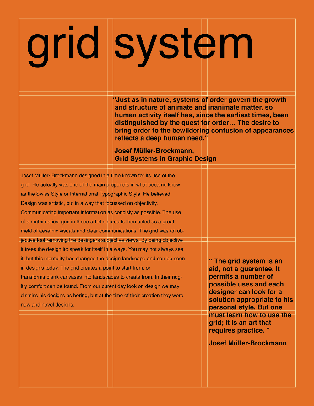
As mentioned in the oldschool layout notes, web-designers think layout in terms of grids. There was a time when we used <table> to create grid-type layouts, this however wasn’t what the table element was designed for & as is often the case with these sorts of hacks, using tables this way comes with a few issues. So eventually developers started creating their own table-like grid using divs & CSS, but this tricky + required lots of CSS classes. But now in the era of CSS3 we have two different systems specifically designed for modern day grid layouts.
ex 1: Flexbox
Flexbox is a series of newer (CSS3) properties for evenly distributing content across rows and/or columns. It's great for laying things out in responsive ways.
To enable it you need to set a parent element's display to "flex" like display: flex.
Once you've done that you can use a number of flexbox related properties that give you lots of control over the way the child elements are displayed. There are also properties you can apply directly to the child elements of a flexbox parent.
There's SO MUCH you can do with this. For a full reference of all the parent & child properties in a flexbox system see this reference by css-tricks.
That said, here's a high level + basic flexbox setup. Let's assume you've got the following HTML
<div class="menu">
  <div>File</div>
  <div>Edit</div>
  <div>View</div>
  <div>Tools</div>
  <div>Help</div>
</div>
Because these are all divs, they will stack up one on top of the other (ie. a column) by default. But if we make the parent div display: flex they will automatically be displayed next to each other (ie. a row).
.menu {
  display: flex;
}
Now we can use other properties to further define how this row looks like.
For example, the "justify-content" property can be used to space out the children in different ways, for example with "space-between" them or "space-around" each or "space-evenly".
We can also "center" them all or "flex-start" to left align & "flex-end" to right align.
.menu {
  display: flex;
  justify-content: space-around;
}
You could also control the direction using flex-direction: row; (which is the default) or flex-direction: row-reverse; to revers the order, flex-direction: column; to arrange them as a column as well as flex-direction: column-reverse;.
You could also control the way items wrap back around using "flex-wrap".
In the notes on how to center things we saw a few different ways to center items horizontally, but I didn't really talk about how to center them vertically... this has always been a little tricky with CSS. But now with flexbox it's much simpler. First we need to give our parent element a specific height, we can declare this in pixels or if we want the full height of the page it's best to use the viewport units height: 100vh. Then we can use the flexbox "align-items" property like this:
.menu {
  height: 100vh;
  display: flex;
  justify-content: space-around;
  align-items: center;
}
Checkout the ex 1: Flexbox demo & use your web inspector to adjust the values to see how quickly you can create otherwise complex layouts. Again, refer to this reference by css-tricks to know what other properties & values you can use with flexbox.
ex 2: CSS Grid
While flexbox is great for things like menus & simple layouts, if you've got a complex grid design you want to implement in a responsive way via CSS then you're likely gonna want to use the CSS grid system. Just like flexbox this can be activated by setting a parent element's display to "grid", for ex: display: grid; which similarly unlocks a whole set of grid related properties that can be applied to individual child elements of the grid parent. Css-tricks also has a great CSS grid reference similar to the flexbox one.
There is so much you can do, just check out these different grid examples, but to get you started here's another high level + basic grid setup. Let's say we have the following HTML:
<div class="row">
  <div>first</div>
  <div>second</div>
  <div>third</div>
</div>
Again, the default behavior would be for those 3 child divs to extend the full width of the page & stack up on on top the other, but we can turn this into a row using CSS grid like this:
.row {
  display: grid;
  grid-template-columns: 1fr 1fr 1fr;
  grid-column-gap: 10px;
}
Let's break that down. The display: grid; is what unlocks the other grid properties.
Declaring "grid-template-columns" let's us decide how big each column (ie. div) in that row should be. We could specify these in traditional units but with CSS grid we get access to the fr which stands for "fraction" of the free space. By setting each 3 of the divs to 1fr they'll be evenly spaced & sized, but we could also do something like grid-template-columns: 1fr 2fr 1fr;, which would make the second div twice the size of the first & last div.
The grid-column-gap: 10px; adds a gap between each column (ie. div) or grid row.
Check out the CSS Grid demo for a slightly more complex example where we've got 3 grids of rows inside another parent grid.
If you resize your browser in either the flex or grid example you'll notice it's pretty responsive & adapts nicely to the various screen sizes.
That said, if you squeeze the browser window too tightly it might start to collapse in strange ways, this will most definitely happen on mobile. this is where @media queries comes in, but that's the next section.

